Photograph by Chris Little
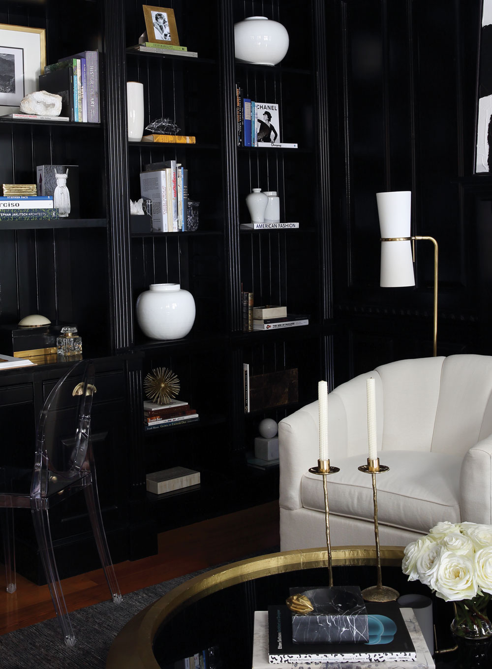
Designing with black
Nina Nash, the accomplished lead buyer and designer of Mathews’ Furniture and Design, is on the fast track to stylemaker status. The edgy young talent is known for sexy, sophisticated interiors that incorporate bold visual moments and saturated shades—including that most intimidating of tones, black. She dreamed up the dramatic retreat featured here with her design partner Don Easterling. Here’s her plan of attack for inky interiors:
1 Pick a shade A green-black room looks stunning with white marble and brass. Graphite looks amazing with dark blues—it’s genteel, creating a Ralph Lauren sort of feel. I recently did a basement in this hue, and I have to admit we were a bit nervous. We mixed in antiques, old oil paintings, a fabulous rich blue velvet sofa. Turns out, it’s the homeowner’s favorite place in the house, especially during winter. When you light the fireplace in a dark room, it comes to life.
2 Compare and contrast You can make the room masculine with dollops of dark Chinese red, or go femme with hot pink and hot orange accents. Paired with white, this scheme can be very vibrant and bright. Wood finishes will add warmth. You can even dress it a bit bohemian with Indian textiles.

Photograph by Christ Little
3 Lighten up Since black rooms are so dark, it’s important to incorporate light-reflecting objects: glass, Lucite, metals.
4 Find your finish If you want glamour, do gloss. Lacquer looks great, but you’re going to have to move out of your house for several days during the painting process—beware of fumes! High-gloss latex is a simple alternative, and very popular at the moment.
5 Go easy Black lampshades can be sexy but also very classic. Try lacquering just the ceiling black, or painting every door in the house black. Think about all those old houses with black shutters and black trim against white.
Photograph by Chris Little
6 Go big Paint the trim and window frames the same shade as your walls. I like to add sheen to make moldings pop. But leave the ceiling white—it keeps things balanced and bright. A dark ceiling on top of dark walls can seem claustrophobic. An alternative? Cover it with a patterned wallpaper—or gold or silver leaf.
7 Pattern play The art you choose should either be very graphic—like the abstract expressionist piece from Wendover Art Group above the mantel here—or light, so it will contrast with the deep backdrop. For fabrics, consider a geometric, especially something monochromatic with variations in sheen. Or opt for a black rug with a cool pattern.
8 Focal points Black can cause architectural elements to recede visually. Call attention to them with high-contrast accessories like curvaceous white ceramics.
9 Fear not! Black spaces can be super versatile. Remember that black is a neutral. Don’t be afraid to use it. Hey, if you love gray, you’re halfway there. Just don’t ever put black with yellow—like a traffic sign. That’s really a nightmare.
Photograph by Emily Followill
Designing with white
Beth Webb’s Buckhead firm never scrimps on sophistication, with a portfolio of calming spaces where white frequently reigns supreme. Next fall, her new Rizzoli tome will share secrets to creating rooms with a bright outlook. For now, here’s some of her wisdom about the ultimate neutral:
1 Crisp and clean I am constantly exploring new whites. I recently went into the Muriel Grateau gallery in Paris and thought, What is this white? It was the cleanest, purest white I’d ever seen. So crisp, so full of light. I literally became obsessed with it. It turned out to be a lime paint—the base for all colors. A similar white can be seen at the High Museum. It’s basically pigment-free.
2 Timeless classic There is a reason white has historically been the number one bestselling paint color. Year after year, it never goes out of style. If you look back over the centuries at iconic cities—Puglia, Santorini, Ibiza—you think about them being in color. That’s because white is the perfect foil for everything else, such as the blue of the sky and sea.
3 Mask imperfections You can hide a lot of bad things with a good coat of white paint. And if you have an incredibly dark space with few windows, white can instantly make it light and uplifting. We’ve been known to paint whole houses the same color—like one we recently did in a warm “China White.”
4 Accent on architecture When you coat molding details in a basic white paint, you reveal so much interplay between the shadows and the crevices. It almost becomes a multicolor surface, creating many shades of gray according to the shadows.

Photograph by Emily Followill
5 Toy with texture Employ different surfaces and details to make the same shade of white look diverse; all of the lights and darks appear as a multitude of different hues. There are many ways to use whites: a lime-washed wood, a creamy dimensional plaster, a cashmere blanket, a wool boucle on upholstery, a white lacquer for gleam and gloss, or a really thick flokati rug.
6 A world of whites There are crisp whites, warm whites, pink whites, apricot whites, blue whites. All whites aren’t the same.
7 Consider context In truth, white is quite chameleonesque. Even the same color can look different depending on the location, because of how much white reflects light. We’ve had clients walk in and ask if we painted a different shade on every wall, yet it’s all the same; it only appears different according to the light. I painted my own living room Pratt & Lambert’s “Seed Pearl.” It appears different throughout the day. At times it can be very warm, and apricot if the sun is coming in from the west window. But in the morning, it reflects a lot of blue.
8 Tried and true In the design community, we spend a ginormous amount of time discussing the search for the perfect white. There are two in particular that everyone seems to gravitate toward: Benjamin Moore’s “White Dove” and Sherwin-Williams’s “Alabaster.” The former goes with everything, especially as a trim or cabinet color, and the other is a beautiful soft color for walls.
This article originally appeared in our Winter 2016 issue of Atlanta Magazine’s HOME.